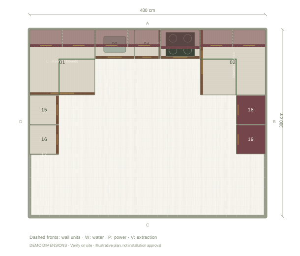
Balance burgundy with walnut
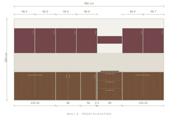
This example keeps the deeper burgundy on the upper cabinets and lets the walnut grain ground the lower run. That order keeps the darker colour at eye level without closing in the worktop. Try the reverse split in the editor if your room gets little daylight, and compare both from the doorway before deciding.
Coordinate the counter and backsplash
The starting palette pairs this combination with a stone worktop and backsplash, so the join between burgundy and walnut stays quiet. A tile backsplash adds rhythm instead; compare its undertone against the walnut grain rather than against the screen colour, and check the change beside the tall units in the elevation.
Compare samples outside the screen
The editor shows illustrative colour and grain: walnut varies between boards, and burgundy fronts can read warmer or cooler beside your floor and daylight. Bring physical samples together in the actual room before choosing a supplier finish, and use the exported material board to communicate the direction rather than as a colour guarantee.
Questions before you start
Can I use burgundy on every cabinet?
Yes. Apply the finish to the whole kitchen, or select one cabinet and change only that front. The layout and dimensions stay the same.
Is the walnut shown a specific supplier product?
No. It is an illustrative finish. Record the chosen manufacturer and product details separately when you specify the real kitchen.